


Slocum test: How to perform, interpret and record it
The Slocum test is a knee drawer test performed with the tibia rotated. It check...

3
Last Updated: Oct 21, 2026

A pain locator chart is an intake form where patients record where they hurt and what the pain feels like.
The free template grades intensity with three symbols, using a circle for mild pain, a triangle for moderate, and a square for severe.
Color marks the type of pain, with red for sharp, blue for dull or aching, and green for burning or tingling.
Location narrows the likely cause, so one-sided lower back pain often points to muscle or sacroiliac joint trouble.
A few patterns need urgent referral, including midline back pain with symptoms in both legs.
One printable page holding patient details, seven numbered instructions for the patient, and a legend that grades pain by symbol and codes it by color. There is also a free-text notes area for triggers, timing, and anything that eases the pain.
Download templateA pain locator chart turns “my back hurts” into something you can measure and compare. It is a one-page intake form the patient fills in themselves, recording where the pain sits and how bad it feels. Ninety seconds of their time shapes the whole consultation.
Location and pain type narrow the likely cause before you lay a hand on anyone. Skip that step and you start the exam half blind, or you miss a red flag hiding inside a familiar-looking backache. So it pays to know what this template holds, how to run it at intake, and how to read the answers.
Three things: where the pain sits, what it feels like, and how bad it is.
Patients record the location themselves, then grade it with the symbol and color legend printed on the sheet. You end up with a snapshot any clinician can read months later.
A plain 0-10 pain scale gives you one number and nothing else. The chart adds a place and a pain type, which is what earns it a spot in structured patient records rather than a drawer.
Pain drawings came out of pain medicine and clinical psychology, where standardized assessment is the norm.
They now turn up wherever musculoskeletal complaints do, from chiropractic practices to osteopathy, physical therapy, sports medicine, and primary care.
Hand it over at check-in and let the patient complete it without coaching. Two minutes is all it takes, and the six steps below keep the answers comparable from one visit to the next:
With digital intake forms, those answers land in the record on their own and last month’s chart is one click away. For a fuller history alongside the drawing, a pain assessment form covers onset, triggers, and what the patient has already tried.

Read it in a fixed order and nothing important slips past. Count the regions first, then look at the pattern, then read the notes:
The finished chart also tells you which confirmatory test to reach for. Use Neer’s test for a painful shoulder arc, or the Pittsburgh knee rules after a knee injury.
Most pain is mechanical, meaning muscle strain, joint dysfunction, or nerve compression. Location still narrows the field.
Use the table to turn a marked region into a shortlist, then confirm it on examination.
Location alone never diagnoses. Correlate it with your examination, imaging where indicated, and the patient’s history. Treat the marked region as your first hypothesis, then test it.
One mark in the lower abdomen can mean a muscle or an ovary. Pelvic anatomy, hormonal cycles, and pregnancy all change how you read the same spot.
Ask about cycle timing before you settle on a musculoskeletal cause:
Two extra questions cover most of this. Ask where the patient is in her cycle, and whether anything has changed reproductively since the last visit.
Pelvic health practices build both into the intake form, so nobody has to remember to ask.
Aching points at muscle and joint, sharp points at nerve or fresh injury, and burning points at nerve irritation. That is why the color legend matters as much as the location.
Ask the patient one question: what does that pain feel like?
Write down the words the patient uses, not your translation of them. For a fuller symptom history, the PQRST assessment form walks through provocation, quality, radiation, severity, and timing.
Consistent language is what makes two charts comparable, which gets easier once you capture forms digitally.
A handful of patterns override everything else on the sheet. Spot one and you escalate rather than treat, whatever the rest of the chart says.
These five checks are what make the chart a safety net rather than paperwork. Build them into whichever review step follows intake, and give the whole clinical team the same list.
Use the same sheet at every visit. Comparing two different chart formats tells you almost nothing, and a practice with three versions in circulation will produce exactly that.
Let the patient mark it before anyone suggests a location. A clinician who points at the lumbar spine will get lumbar marks, which adds no information at all.
For chronic cases, send a pain journal home between visits. Daily entries catch flare patterns that a single snapshot at check-in cannot show.
Then train the team to flag movement. A mark that spreads from one side to both belongs in the progress note. So does a circle that has become a square.
Paper works right up to the moment you need to compare two visits. Then someone walks to a filing cabinet.
Practice management software like Pabau removes that trip by capturing the same fields on a digital form the patient completes before arrival.
The completed form lands in the client record, timestamped and attached to the appointment. You can search it, open the last three versions together, and see whether a square has become a circle. Measurement tracking does the same job for any score you repeat at every visit.
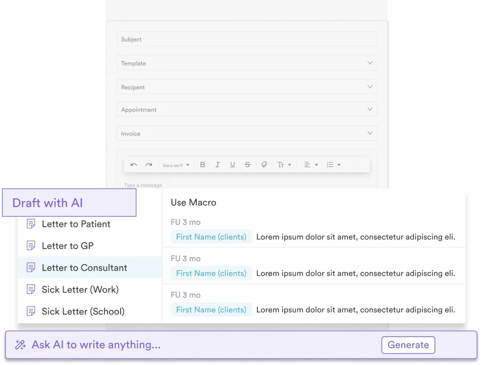
That pays off most at handover. When a red flag appears, Pabau drafts the referral letter from the record, so nobody retypes the history. The thread then sits inside patient management software your team can see.
The outcome is simple enough. Less of the appointment goes on hunting for last month’s chart, and more of it goes on the patient in front of you.

Pabau’s digital intake forms capture pain location, intensity, and quality in a structured format that flows straight into your patient records. See how your practice can move from paper charts to searchable clinical data.

The chart earns its keep in about two minutes of a patient’s time, and it keeps earning it at every follow-up. What you do with the finished sheet decides whether that holds true.
File it where the next clinician will find it, use the same version every time, and read it in the same order. Do that and the drawing stops being a formality and starts steering the examination.
One trade-off is worth remembering. A three-level legend is faster for patients than a 0-10 score, so accept that it is coarser and lean on the notes box for detail. Book a demo to see how Pabau captures pain charts at intake and keeps them searchable across visits.

Reviewing your practice’s liability coverage? chiropractic liability insurance guide explains how paid claims become a permanent record at license renewal and credentialing.
Need to measure function, not just pain? The functional status questionnaire tracks what the patient can do, which is what treatment is judged on.
Comparing chiropractic practice management software? chiropractic practice management software comparison covers six vendors on charting, claims, and pricing transparency.
Deciding between closed and open fracture reduction? closed vs open reduction guide compares manual fluoroscopic-guided technique with surgical exposure and direct alignment.
Yes. Pain drawing, body chart, pain map, and pain diagram all describe the same tool. The wording just varies by specialty.
Older children can. Below roughly age seven, a faces scale like Wong-Baker FACES works better, and it is validated from age three.
Widespread marks point away from a single mechanical cause. Consider central sensitization, fibromyalgia, or distress, and screen for those before treating each site.
As long as the rest of the medical record. Retention periods come from state law, not HIPAA, so check your state rule first.
At every visit while pain is acute, because the picture changes fast. For stable chronic pain, every four to six weeks is enough.
No. Keep the numeric score if your notes already use one. The chart adds location and pain type, which a single number cannot carry.