


Bear hug test: Procedure, interpretation and free template
The bear hug test is a quick shoulder special test that screens for subscapulari...

3
Last Updated: Oct 23, 2026
The Hyperbole and a Half pain scale is Allie Brosh’s humorous pain chart, with a relatable description for each pain level (0-10). It starts at Level 0, “I don’t know why I’m even here.” Then it runs past 10 to an 11 and a “Too Serious For Numbers” tier.
Patients pick the description that sounds like them, and you translate it into a 0-10 score for the chart. It isn’t formally validated, so it works best as an icebreaker at intake, backed by a validated scale. This guide maps every level to a chartable score and includes a printable template.
A printable, Pabau-branded patient form with fields for name, date of birth and record number, plus space for notes to the care team. Hand it out at intake or keep it on file.
Download template
Allie Brosh’s Hyperbole and a Half pain scale runs from Level 0 to 10, then adds an 11 and a “Too Serious For Numbers” tier.
Each level pairs an intensity with an exaggerated reaction. Level 2 is “I probably just need a Band Aid,” and Level 10 is being mauled by a bear.
Levels 0 to 10 share their numbers with the 0-10 numeric rating scale, so you can chart a patient’s choice as an NRS score.
The scale isn’t formally validated, so use it to open the pain conversation and record the formal score on a validated tool.
Pabau, the practice software we build, can send the scale before the visit and save each answer to the patient record.
The scale comes from Allie Brosh’s 2010 blog post “Boyfriend Doesn’t Have Ebola. Probably.” She redrew the hospital pain chart, which she felt didn’t have all the numbers. Her target was the clinical Numeric Rating Scale (NRS), which runs from 0 (no pain) to 10 (worst pain imaginable).
Instead of a bare number, each level gets a scenario a patient can recognize. Level 1 reads: “I am completely unsure whether I am experiencing pain or itching or maybe I just have a bad taste in my mouth.” Level 7 is “I see Jesus coming for me and I’m scared.”
What started as a comic has found an informal place in practice. Nurses, therapists and pain specialists reference it because the humor eases the tension patients feel when reporting pain. The descriptors also capture how the patient is coping, alongside how much it hurts.
Level 1 also raises itching, which a pain score on its own does not describe. The Hell’s Itch pain scale records both, rating intensity alongside descriptors of the itch itself.
Brosh’s chart has 13 tiers. The first 11 share their numbers with the NRS, which clinical teams commonly band as mild (1-3), moderate (4-6) and severe (7-10). The table pairs each descriptor with the score you would document.
The tiers past 10 are where the joke lands hardest, and they need a rule before anyone charts them. The NRS stops at 10, so a patient pointing at 11 goes in the record as 10, with a note of the tier they chose. The chart below shows how all 13 tiers fold into the NRS bands.
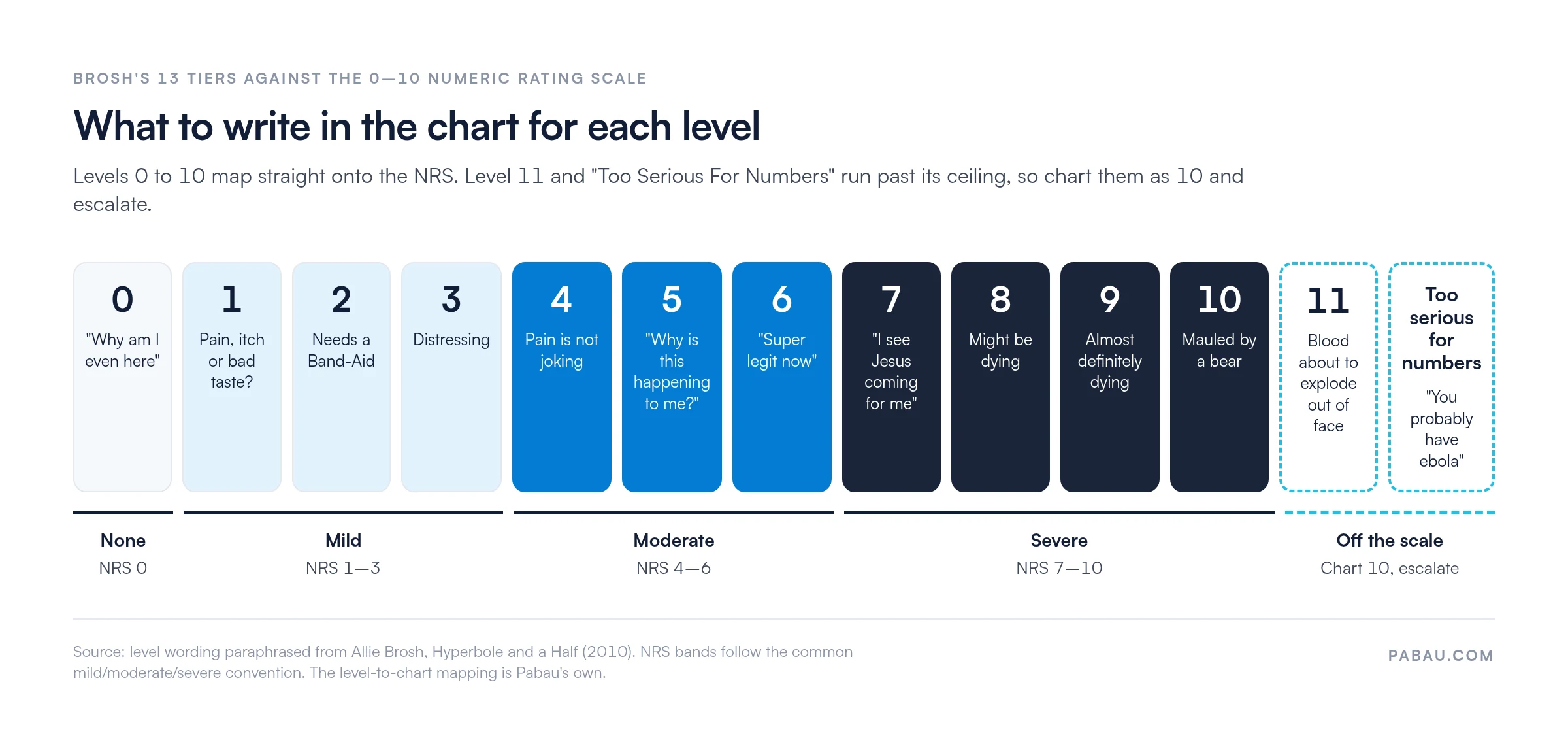
The humor serves a clinical purpose too. Each descriptor names a reaction, such as confusion, worry, fear or desperation, alongside the intensity. That tells you how the pain is affecting the patient, which a bare number leaves out.
Practitioners reach for it over a purely numeric tool for three reasons:
Brosh’s chart is the friendliest of the three tools below, and the only one without formal validation. That makes it a fit for intake rather than for the record.
Use the Hyperbole and a Half scale for intake, triage and rapport. Use the NRS or the Mankoski scale for clinical documentation, audit and research. Together they give you a patient who opens up and a score that holds up in the notes.
All three tools depend on the patient self-reporting. Newborns cannot do that, so score their observed behavior with the NIPS behavioral pain scale instead.
Our guide to pain assessment scales covers the other validated options and when each one fits.
Fold the scale into your workflow in five steps:
Many practitioners keep the scale visible during the appointment. Patients often refer back to it (“I was a Level 5 last month, and I’m at a 3 now”), which makes progress concrete and motivating.
You can customize the template for your practice. Adjust the font size, add your logo, or drop the “Jesus” reference where it may not suit your patients. The scale keeps working after edits like these, as long as each level still describes a scenario patients recognize.
On paper, the scale gets handed over at check-in, and someone copies the patient’s answer into the notes by hand. That eats into appointment time and invites transcription errors.
Pabau’s automated workflows send the scale by SMS or email before the appointment instead. Patients arrive having already thought about their pain, so you can open with the discussion rather than the explanation.
Each answer is saved to the patient record next to your notes, so progress across visits sits in one timeline. For physical therapy teams, the same forms live inside a physical therapy EMR that also runs booking and treatment plans.

Pabau sends the pain scale to patients by SMS or email before the visit and saves each answer to the patient record. You can start each appointment by discussing the result.

Use the Hyperbole and a Half pain scale for what it does best: getting patients to talk about pain they might otherwise play down. Pair it with a validated score every time, and agree in advance how your team charts an 11.
Settle that rule once, and the humor at intake never costs you accuracy in the notes. Book a demo to see how Pabau sends pain scales before the visit and files every answer in the patient record.

Prefer a line over a number? Visual analogue scale (VAS) lets patients mark their pain on a line instead of picking a score.
Need the whole intake in one form? Pain assessment intake form template collects pain history, location and intensity before the first visit.
Want to know where it hurts? Body pain chart lets patients mark the location of their pain on a body outline.
Assessing a patient who can’t self-report? FLACC pain scale scores pain from behavior in young children and nonverbal patients.
The Hyperbole and a Half pain scale is a humorous, patient-friendly pain chart by Allie Brosh. It replaces numeric pain ratings with exaggerated descriptors for levels 0-10. It continues past 10 to an 11 and a “Too Serious For Numbers” tier. It improves patient engagement and captures the emotional impact of pain alongside intensity.
Level 0 means no pain. Levels 1 to 3 read as mild, 4 to 6 as moderate, and 7 to 10 as severe, ending with being mauled by a bear. Level 11 and “Too Serious For Numbers” sit beyond the NRS, so chart them as 10.
No, it has not been formally validated by research. It works as an engagement and intake tool for opening the conversation. For formal documentation and clinical trials, use the Mankoski scale or the numeric rating scale (NRS).
Download the PDF template from the box at the top of this page. Adapt it to your practice with your logo, font size and wording, then print it or show it on a tablet at intake. You can also build it into your intake forms in Pabau.
No, use it alongside them. The scale works best for opening the conversation and engaging patients at intake. Follow up with a validated scale, such as Mankoski, the NRS or the visual analogue scale (VAS), for official documentation and progress tracking.