


PCS pain catastrophizing scale: Scoring, cutoffs, and free template
The PCS pain catastrophizing scale is a 13-item self-report questionnaire that m...

1
Last Updated: Oct 15, 2026

The visual analogue scale is a 100 mm line where the patient marks their pain between ‘no pain’ and ‘worst pain imaginable’.
You score it by measuring from the left anchor to the mark in millimeters, which gives a 0 to 100 result.
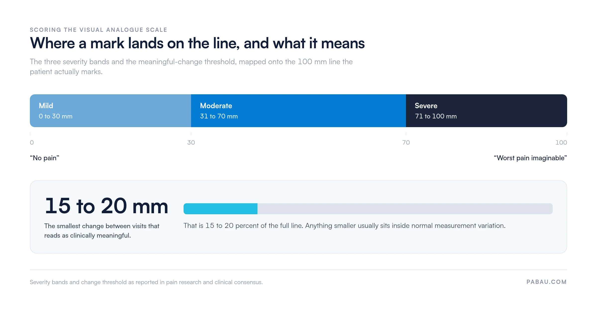
Read 0 to 30 mm as mild pain, 31 to 70 mm as moderate, and 71 to 100 mm as severe.
A shift of 15 to 20 mm between visits usually signals a genuine change rather than measurement noise.
Practice management software like Pabau records each score and charts it over time through measurements tracking.
A standardized 100 mm pain measurement tool that lets patients self-report pain intensity on a continuous visual scale. It is widely used in physical therapy, pain management, and clinical research.
Download templateThe visual analogue scale (VAS) asks a patient to mark their pain on a single 100 mm line. That mark becomes a number you can chart. Simple as it looks, the scale is one of the most sensitive pain measures in clinical use.
What makes a score usable is the measurement itself, taken in millimeters from the left anchor to the mark. Measure it loosely and your progress notes stop meaning much.
The template above is ready to print. The rest of this page covers administration, scoring, and the errors that quietly distort a patient’s trend line.
The scale turns a subjective feeling into a continuous number. The patient marks one point on a 100 mm horizontal line. “No pain” anchors the left end and “worst pain imaginable” anchors the right. The line carries no numbers and no midpoints, and that is the whole point.
Categorical scales push patients into three or four boxes labeled mild, moderate, or severe. The VAS keeps the space between those boxes open, so a patient who improves slightly can show it.
That sensitivity is why physical therapists and pain management practices use it to track treatment over months rather than minutes.
Consistent administration is what makes two scores comparable. Run the same five steps at every assessment, and write them into your protocol so a locum does the same.
A score on its own rarely tells the full story. Pair it with a pain assessment intake form so the site, the pattern, and the aggravating movements sit alongside the number.
The distance you measured is the score, and it reads as continuous data. Most practices group it into three bands drawn from pain research and clinical consensus.
A single score is a snapshot. The comparison between visits is where the value sits. A change of 15 to 20 mm or more usually reads as a clinically meaningful shift rather than measurement noise. The scale below maps both the severity bands and that threshold onto the line itself.
Some patients report swings that follow the weather rather than their treatment. A barometric pressure pain log sets each daily rating against that day’s pressure reading, so a weather-linked pattern shows up in the trend.
The horizontal 100 mm line is the default, and most published evidence uses it. A few variants exist for patients the standard format does not suit.
Whichever version you pick, stay with it. Switching format halfway through a course of treatment makes the trend line unreadable, and you cannot fix that retrospectively.
What it does well. The scale needs almost no instruction. It produces continuous data that picks up small changes. Patients cannot round to a favorite number, because there are no numbers to round to. The visual format also travels well across language barriers, which helps in a mixed patient list.
Where it struggles. Some patients find a line without numbers hard to interpret. Older adults and patients with cognitive impairment often do better on a categorical scale. Paper scoring adds a manual step, and manual steps introduce error. Children under five rarely use the VAS reliably, so a faces pain scale suits them better.
Patients who cannot self-report at all need an observational tool instead. In intensive care, the CPOT pain scale scores pain behaviors a clinician can see at the bedside.
Reach for the NRS when you need a fast number, and the VAS when you need to track change. Both are validated instruments. They differ mainly in what they can detect.
Most practices end up running both. The numeric pain rating scale handles triage and quick screening at the desk, while the VAS carries the longitudinal record.
The VAS shows up wherever pain has to be tracked rather than simply noted.
Scores mean more when they sit next to the functional measures and treatment dates in one record. That is why physical therapy practices tend to keep pain tracking inside the clinical system rather than in a side spreadsheet.
The scale itself rarely fails. Printing and measuring are where scores go wrong, and neither problem announces itself. Run through this list before the template goes into circulation.
None of this adds appointment time. It only has to be agreed once and written down where the team can find it.
Strong, and it goes back decades. A 2018 validation study found that a digital VAS produces measurements equivalent to paper, with high correlation across adult populations. The Physio-Pedia evidence review covers its reliability and sensitivity in physical therapy populations specifically.
Test-retest reliability holds up well when administration is standardized. Inter-rater reliability does not apply here, since the patient reports the score rather than a clinician. Repeat measurement of the same mark by the same scorer is highly consistent.
Paper scoring works fine until you need the history. Then someone pulls the folder, finds four loose forms, and measures them all again to build a picture for a review appointment.
Practice management software like Pabau takes both jobs off the desk. Patients complete the scale on a tablet at check-in, or through a link before they arrive. The score lands in the patient record next to the appointment note, so nobody transcribes it twice.

From there, measurements tracking scores each entry automatically and plots it against its date. You see a trend instead of a list, which is what a progress report or an insurer needs.
Scores stored this way stay attached to structured patient records your team can open at the point of care. Documentation stays audit-ready without a second system to maintain.
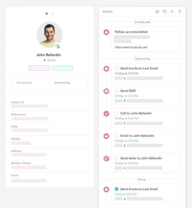

Pabau captures the visual analogue scale on a tablet or a pre-visit link, then charts each score against its date in the patient record. Your team stops re-measuring old forms to build a progress report.

The scale rewards consistency more than technique. Use the same printed line, the same wording, and the same measuring convention. Then a score in March means what a score in January meant.
Print the template, agree the administration script with your team, and decide who measures. Those three decisions do more for the quality of your data than any redesign of the form.
If pain scores are your main outcome measure, they belong in the patient record rather than a filing cabinet. Book a demo to see how Pabau captures the scale and charts every score over time.

Need the 0 to 10 version instead? Numeric pain rating scale gives you the faster screening tool for triage and acute visits.
Want the story behind the score? PQRST pain assessment form structures the questions that explain why a number moved.
Building your intake paperwork? Pain assessment intake form template captures history, site, and aggravating factors before the first session.
Need the patient to show you where it hurts? Back pain location charts let patients map the site of pain alongside its intensity.
Tracking upper-limb function too? QuickDASH outcome measure adds a validated function score to sit next to your pain data.
Yes. The scale is not proprietary and carries no license fee, unlike several branded outcome measures. Print it, adapt the anchor wording to your specialty, and store the scores in your own records.
Under a minute for most adults, including the spoken explanation. First-time patients often need one extra sentence of instruction, which is why the wording is worth agreeing on in advance.
Yes, and researchers routinely do. Most treat VAS data as interval data, so means and standard deviations appear throughout the literature. For one patient, though, the change between visits tells you more than any average.
Yes, as long as the patient can see the line and mark it. A digital slider on the patient’s own screen beats holding paper up to a camera. You cannot measure a mark you cannot reach.
It can, and it often helps. A dated series of scores evidences medical necessity for continued treatment far better than a note saying the patient feels better.