


List of vitamins: All 13 with RDAs and deficiency signs
A list of vitamins names the 13 essential vitamins the body needs from food or s...

12
Last Updated: Oct 8, 2026

The food pyramid is a visual nutrition guide that ranks food groups by how much of each a patient should eat.
On January 7, 2026, the Dietary Guidelines for Americans 2025-2030 replaced MyPlate with a new pyramid graphic.
The new pyramid is inverted. It is widest at the top and narrows to a single point at the bottom.
Protein, dairy and healthy fats fill the wide top tier. Vegetables and fruits sit below them, and whole grains form the narrow bottom point.
Processed foods, refined carbs and added sugar are not a tier at all. The written guidance asks readers to cut them back sharply.
Practices use the food pyramid template to record dietary patterns, teach portion proportions, and build personalized meal plans.
A one-page nutritional assessment and education form for nutrition consultations. Record the patient’s baseline, walk them through the current food pyramid tiers, and agree on the dietary changes you will document. Print it for the consultation room or share it digitally after the appointment.
Download templateThe food pyramid is a nutrition education tool that practitioners use to guide patient dietary choices and assess eating patterns. Unlike diet trends that come and go, it gives you a structured framework for discussing balanced nutrition across all ages and health conditions.
It also changed shape in January 2026, so the version most patients remember is no longer the current one. This guide covers what the pyramid is, how it has evolved, and how to apply it in a consultation.
The food pyramid is a triangular diagram that sorts foods into tiers by how much of each one a person should eat. The tier that takes up the most width is the tier to eat most of. Classic versions from 1992 onward put staple foods in a wide base and limited foods in a narrow top.
The current USDA pyramid reverses that shape entirely. Either way, the diagram translates the Dietary Guidelines for Americans into a picture a patient can read in seconds.
The framework helps practitioners structure patient education conversations. Rather than listing dos and don’ts, the pyramid shows proportions visually. Patients see at once that a plate should hold more protein and vegetables than bread.
The original USDA food pyramid, introduced in 1992, organized six food groups into a triangle with grains at the wide base. Fats, oils and sweets sat in the narrow tip, labeled for sparing use. This version reflected the nutrition science of its time, and it treated carbohydrate-heavy diets as the healthy default.
In 2005, the USDA replaced it with MyPyramid, which added an exercise graphic to signal the importance of physical activity. By 2011, the government simplified further with MyPlate. That model dropped the pyramid shape and divided a dinner plate into quadrants.
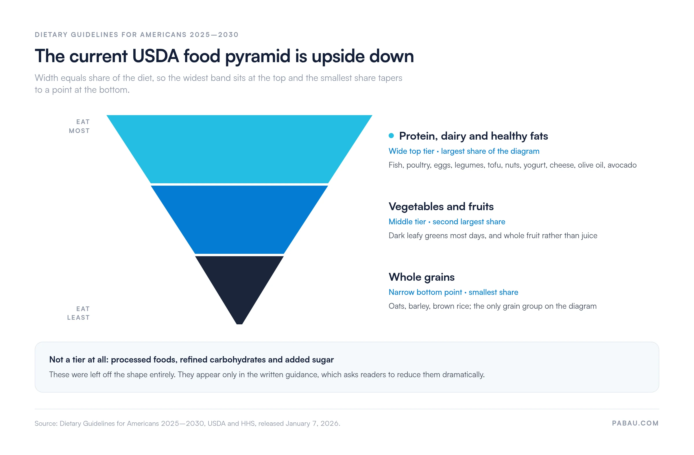
On January 7, 2026, the USDA and HHS released the Dietary Guidelines for Americans 2025-2030. That release retired MyPlate and brought back a pyramid, but drawn upside down. The graphic is widest at the top and narrows to a single point at the bottom.
So the widest tiers are now the recommended ones. Protein, dairy and healthy fats fill the top band. Vegetables and fruits sit in the band below, and whole grains alone form the narrow point at the bottom.
Processed foods, refined carbohydrates and added sugar were left off the shape altogether. The accompanying text asks readers to reduce them dramatically instead of assigning them a tier. The diagram below shows the whole structure, off-pyramid guidance included.
For practitioners, that puts your nutrition messaging on an updated foundation. It also means the diagram on your wall may need replacing.
The old food pyramid put bread and grains in the wide base, at 6 to 11 servings a day. The new pyramid inverts the whole diagram rather than simply reshuffling the tiers. The table below sets the two versions side by side, tier by tier.
One practical consequence is worth flagging to patients. Because the shape flipped, anyone reading the new graphic the old way will draw the opposite conclusion from the one intended. Point at the width of each band rather than its height on the page, and the confusion clears up quickly.
The direction of travel also matches years of clinical research on protein, whole foods and metabolic health.
The current pyramid has three tiers, read from the wide top down to the narrow point. Width equals share of the diet, so the top tier is the one to build meals around.
Patients often look for a tier holding chips, soda and white bread, and there isn’t one. Processed foods, refined carbohydrates and added sugar were deliberately left off the shape.
They appear only in the written guidance, which asks readers to reduce them dramatically. Treat that as a fourth instruction rather than a fourth tier when you explain the diagram.
The template is a single-page clinical form you complete with the patient during a nutrition consultation. It captures the baseline you need before recommending any dietary change, and it leaves room to write the plan down.
Print it for the consultation room, or attach it to the patient record and complete it on screen. Either route gives you a dated document showing that nutrition counseling took place. Pair the form with a printable nutrition handout when the patient wants written guidance to take home.
Translating the pyramid into meals takes five practical steps you can teach a patient during a consultation.
Practice management software can streamline this with digital patient intake forms. Patients complete a dietary assessment before the appointment, so their baseline is ready when the consultation starts.
If the patient wants the tiers turned into meals, hand them a whole food diet plan to work from.

The template serves several clinical settings. Functional medicine practitioners use it during metabolic health assessments, and registered dietitian nutritionists reference it in counseling sessions. It also earns its place in weight loss practices, where patients see portion proportions rather than calorie totals.
Primary care physicians fold it into preventive care consultations. Wellness and longevity practices use it to explain anti-inflammatory, nutrient-dense eating. Occupational therapists and mental health practitioners benefit too, since diet affects mood, energy and day-to-day function.
Simplifies complex nutrition science: Rather than rattling off micronutrient ratios, you show patients a visual they can apply immediately at home.
Improves patient compliance: A visual reference patients can print and post on the kitchen fridge creates lasting behavior change. A handout they file away rarely does.
Supports documentation: Marking food group servings in the patient record shows evidence of nutritional counseling for insurance and compliance audits. Structured clinical notes that reference the pyramid document exactly what patient education you delivered.

Keeps your advice current: Patients who read about the January 2026 update will ask about it. Teaching the inverted pyramid shows that your nutrition guidance tracks the published guidelines.
The Harvard T.H. Chan School of Public Health publishes its own Healthy Eating Pyramid, and it differs from the USDA version in several ways. The Harvard model keeps the traditional orientation, with a wide base and a narrow top.
It places daily exercise and weight management at that base, on the argument that diet alone cannot create health without movement.
It also separates healthy fats from unhealthy ones, recommending plant oils and fish while discouraging saturated and trans fats. Carbohydrates are graded by quality, so whole grains rank high and refined carbohydrates rank near the tip. On substance, that puts the Harvard pyramid closer to the 2025-2030 USDA update than to the 1992 original.
For integrative and functional medicine practices, the Harvard model often feels closer to the counseling they already do. It emphasizes whole foods and food quality above all. Many practitioners show both diagrams and name the difference in orientation out loud, which stops the comparison from confusing anyone.
The dietary conversation often happens well and then evaporates. The patient leaves with a printout, the height and weight go on a paper form, and the agreed first change never reaches the record. Six weeks later nobody can say what was recommended, so the next appointment starts the same conversation again.
Practice management software like Pabau closes that loop. Patients complete the dietary assessment through online booking before they arrive, so their baseline is waiting for you. The completed food pyramid template attaches to their medical record alongside the consultation note. The patient portal then delivers the same document to them at home.
The result is a nutrition plan you can pick up mid-conversation months later, plus an audit trail showing what education was delivered and when. Any practitioner in the practice can open the record and continue where the last one stopped.

See how Pabau’s digital forms and patient portal help practices deliver consistent, documented nutrition counseling.

The orientation is the part to carry into your next consultation. Point at the width of each band, not its height, and the new pyramid teaches itself.
The trade-off worth remembering is that a patient’s memory of the 1992 diagram will fight you. Expect to correct it out loud, every time, until the new shape becomes familiar. Print the template, use the patient portal to share it, and each consultation ends with a takeaway the patient can hold.
Book a demo to see how the assessment, the completed form and the follow-up plan sit in one patient record.

Need to document the nutrition assessment properly? ADIME note template gives you the assessment, diagnosis, intervention, monitoring and evaluation structure dietitians chart in.
Want to turn the tiers into macro targets? 30/30/40 diet plan splits the plate into protein, fat and carbohydrate shares a patient can count.
Treating a patient with chronic inflammation? Anti-inflammatory meal plan template applies the same top-tier emphasis to a condition-specific week of meals.
Patients unsure what to buy? Grocery list for weight loss turns the tier proportions into a shopping trip they can follow.
Need a short structured plan to start with? 2 week diet plan for weight loss gives the patient a 14-day framework before you review progress.
The current official guidance is the food pyramid published in the Dietary Guidelines for Americans 2025-2030, released on January 7, 2026. It replaced MyPlate, which the USDA had used since 2011. The graphic is an inverted pyramid. Protein, dairy and healthy fats fill the wide top tier. Vegetables and fruits sit below them, and whole grains form the narrow bottom point.
Three things. First, the graphic flipped orientation, so it is now widest at the top and narrows to a point at the bottom. Second, it replaced MyPlate as the official USDA visual on January 7, 2026. Third, the tier contents changed. Protein, dairy and healthy fats took the widest tier, vegetables and fruits the tier below, and whole grains the narrow bottom point. Processed foods and added sugar are no longer shown as a tier, and appear only in the written guidance as foods to reduce dramatically.
MyPlate was a plate-shaped visual that showed portion sizes within a single meal, and the USDA used it from 2011 until January 2026. The food pyramid instead ranks food groups by daily share across all meals, using the width of each tier. The 2025-2030 guidelines retired MyPlate and returned to a pyramid, this time drawn upside down.
Yes. Registered dietitian nutritionists, functional medicine practitioners and wellness coaches use the pyramid because it communicates proportional eating quickly. The 2025-2030 guidelines made it the official USDA visual again, so the framework now matches current federal guidance rather than sitting alongside it.
Yes, with age-appropriate serving size adjustments. The tiers stay the same. Portion sizes scale down for children ages 4 to 8 and increase for adolescents and adults. A pediatric-adapted food pyramid guides caregivers on appropriate nutrition for growing children.