


Getting along with siblings worksheet
A getting along with siblings worksheet is a printable that helps children and t...

2
Last Updated: Oct 23, 2026
A mental health color chart is a reference guide that maps colors to mental health conditions, emotional states, and therapy spaces. It covers two layers.
The first is awareness ribbon colors, such as the green ribbon that Mental Health America uses for mental health awareness. The second is color psychology, meaning the moods different colors tend to evoke in patients and staff.
Green stands for mental health in general, teal for anxiety, OCD, and PTSD, and gray for depression and borderline personality disorder (BPD). Soft blue, green, lavender, and warm neutrals are the usual picks for a calming therapy room. Bright red, bright yellow, and stark white tend to overstimulate anxious patients.
This guide gives the ribbon color for each major condition and explains why green became the global symbol. It also covers which colors calm or overstimulate patients, and how therapists use color in sessions. The free download below adds a printable log for recording triggers and 0–10 intensity ratings.
A printable form with a 14-row reference table for situations or triggers, 0–10 intensity, range notes, and the source and date checked. It also includes a dated recording log and a notes page for tracking ratings across sessions.
Download template
A mental health color chart maps awareness ribbon colors (green for mental health, teal for anxiety, gray for depression) to psychological associations and therapy uses.
Green is the primary mental health awareness color worldwide, and each major condition has its own ribbon color.
Teal stands for anxiety, OCD, and PTSD, so label every color with the condition name on patient materials.
Blue, green, lavender, and soft neutrals help calm a therapy room, while bright, warm colors can overstimulate anxious patients.
Pabau, the practice software we build, keeps intake answers, check-in questionnaires, and AI-drafted session notes together in each patient record.
A mental health color chart is a reference tool that pairs colors with conditions, emotional states, and therapeutic recommendations. It does two jobs. As a clinical reference, it lists the ribbon colors for conditions like depression, anxiety, and OCD. As a design guide, it shows which colors calm patients, which support focus, and which to avoid in therapy rooms.
Therapists put it to work in three places:
If your notes live in a mental health EMR, use the same color bands and labels in every note so scores stay comparable. Print a copy of the chart for the office, share it at intake, or keep it on screen while you explain a treatment plan.
Green became the global color for mental health because it symbolizes growth, renewal, and healing. Those ideas sit at the center of recovery. Mental Health America adopted the green ribbon as its symbol for mental health awareness. Advocacy campaigns, supporters wearing the ribbon, and organizations worldwide then spread it.
The green ribbon took hold in the 1990s and has stayed the main symbol since. In color psychology, green suggests balance, calm, safety, and renewal, which patients and clinicians link with progress. It also avoids the heavier associations of other colors, such as blue with sadness and gray with depression.
Today the green ribbon appears on Mental Health Awareness Month materials, practice websites, support group logos, and patient handouts. In a mental health setting, green tends to signal support and acceptance before anyone says a word.
Different conditions have officially recognized or widely adopted ribbon colors. The table shows the main color for each one, as used by advocacy organizations, practices, and support networks.
Note: Ribbon colors vary by country and organization, and some conditions have more than one ribbon. Check the organization’s official color before you design patient materials or signage. For US campaigns, NAMI is a good place to start.
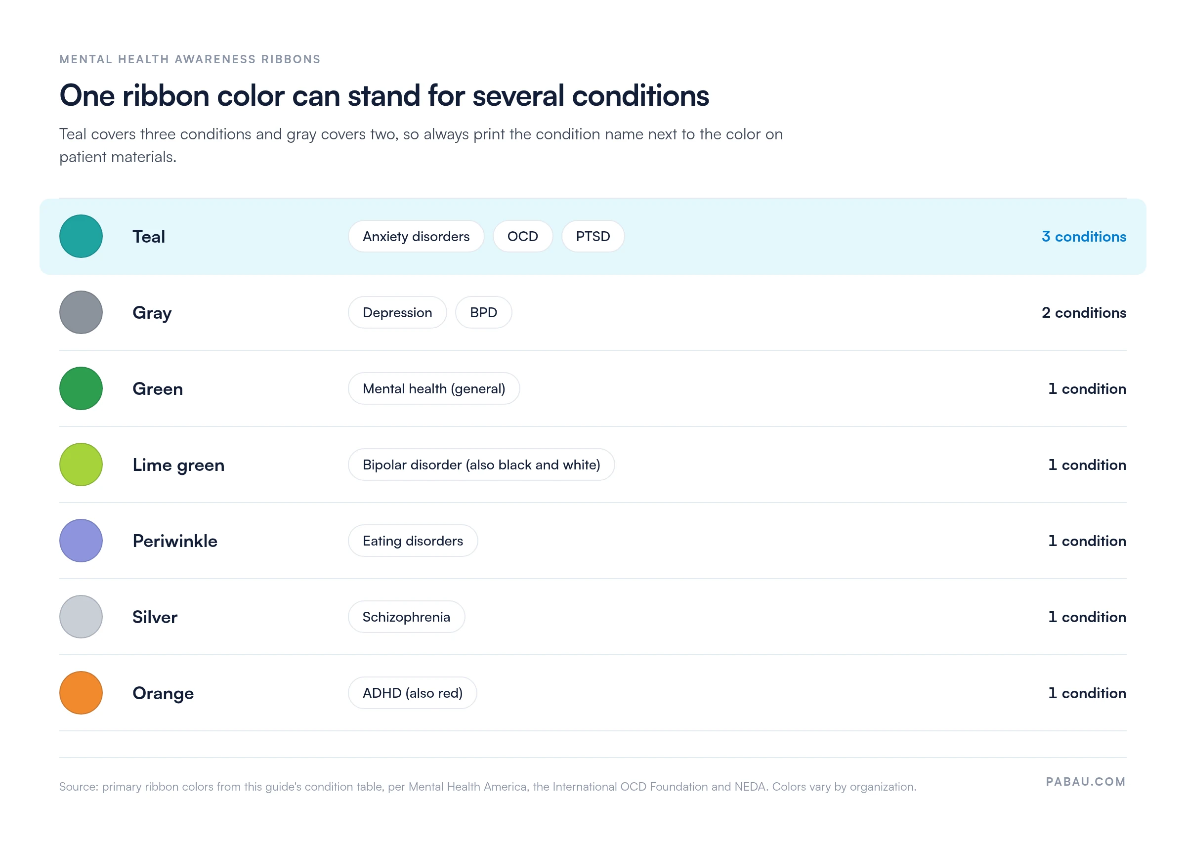
Several conditions share one color, as the chart below shows. Teal covers anxiety disorders, OCD, and PTSD, and gray covers depression and BPD. So never let color carry the meaning on its own in a handout or on a sign. Print the condition name beside every swatch, which also helps patients with color vision deficiency.
Teal, a blend of blue and green, or light blue is the awareness ribbon color for anxiety disorders. Anxiety advocacy organizations use it across their awareness campaigns.
Psychologically, teal and light blue suggest calm and clarity, which anxious patients need. Anxiety also carries secondary color associations. Gray links to nervous tension, yellow to nervous energy, and white to clarity but also coldness. In waiting areas for anxious patients, lead with teal and light blue, and avoid harsh yellows or stark whites.
In sessions, some therapists use teal-coded rating tools for check-ins, such as a 0–10 anxiety scale on a teal background. Using the same scale every session keeps the experience consistent and makes changes easier to track.
Gray and blue are the main colors associated with depression. Many depression awareness campaigns use the gray ribbon. Blue, especially dark or cool blue, reflects the long-standing link between blue and low mood, hence the phrase “feeling blue.”
In color psychology, blue signals introspection and calm, but also heaviness and withdrawal. That’s why blue needs balancing in a therapy room. A muted cool blue can feel reflective and peaceful, while too much dark blue can deepen a low mood. Pair cool blues with warm accents like cream or soft gold, and let in natural light.
For depression screening, some clinicians use gray-toned severity bands or blue-background assessment forms. This keeps the screening visually consistent with the condition’s symbolism.
Environmental psychology research links certain colors with lower anxiety and a greater sense of safety. The table below sums up the calming colors used most in therapy rooms, mental health practices, and wellness spaces.
Colors to avoid in anxiety-focused spaces: Bright red raises arousal and bright yellow overstimulates. Stark white feels clinical and cold, while dark gray or black feels heavy. If you want warm tones, choose soft peach or warm cream over intense orange or bright red.
Color shows up in three parts of a therapist’s day. It shapes the rooms patients sit in, the tools they rate their mood with, and how a diagnosis gets explained.
The waiting room is the first space a patient sees. Soft blue or green walls, natural light, living plants, and nature artwork all signal safety. Avoid a clinical look by painting walls warm white or soft beige. Add blue or green through cushions or artwork, and choose comfortable seating.
Many therapists use color-coded emotion wheels, mood scales, or feelings charts in sessions. A patient might rate anxiety from 1 to 10 on a teal-to-green gradient, which makes an emotional shift visible. A daily mood chart extends the same idea to the days between sessions.
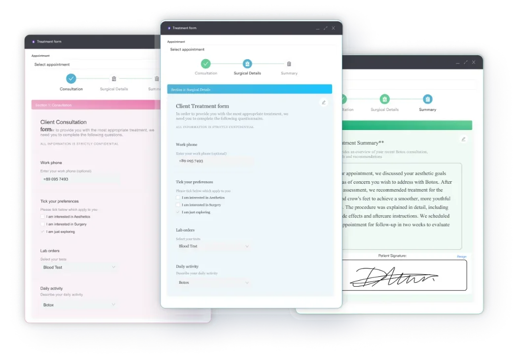
Digital intake forms can carry the same color scheme into check-in questions. Teal can mark anxiety items, gray-blue depression screening, and green progress and positive mood. Keep the colors and labels identical across forms so patients learn to read them at a glance.
When explaining a diagnosis, therapists often show a color-coded diagram or point to the awareness ribbon color. This makes the diagnosis less abstract and connects the patient with a wider support community. Saying “Generalized anxiety disorder has a teal awareness ribbon” normalizes the condition and shows that support exists.
Many therapists still record mood scores on paper scales or in a notebook, then retype the numbers into session notes. Comparing this month’s anxiety rating with last month’s then means digging through files.
In Pabau, intake forms and check-in questionnaires go out before the appointment, and the answers save straight to the patient record. Pabau Scribe, our AI medical scribe, drafts the session note from your conversation for you to review and sign.
Each patient ends up with one record that holds their check-in answers, session notes, and letters. You spend less time on admin and more time with patients, with simpler therapy practice management across the team. If you’re still comparing systems, our guide to the best mental health EHR software sets out the options.
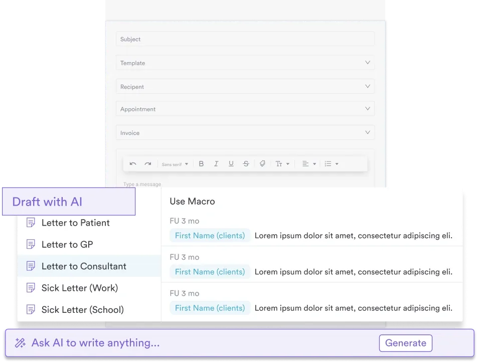

Pabau’s digital forms and Pabau Scribe, our AI scribe, save check-in answers and session notes to one patient record. You spend less time retyping scores and more time with patients.
Color helps most in a mental health practice when a label sits right beside it. Start with the two choices every patient meets. Use calming colors in the rooms they wait and talk in, and label the ribbon colors on whatever they take home.
Then pick one color-coded mood scale and use it in every session, on paper or in your psychology practice software. Consistency is what turns a single score into a trend you can act on. Book a demo to see how Pabau keeps intake answers, check-ins, and session notes in one patient record.

Working with patients who struggle to name feelings? Feelings face chart pairs expressions with emotion words for quick check-ins.
Want a structured start to each session? Mental health check-in worksheet gives you a ready-made set of check-in questions.
Need a clear format for therapy notes? SOAP note for mental health lays out a SOAP structure for session documentation.
Comparing mental health software? Top mental health software in the US compares seven platforms for therapy and psychiatry practices.
Green is the color for mental health awareness worldwide, adopted by Mental Health America and widely recognized. The green ribbon symbolizes growth, renewal, and healing, which are the core values of mental health recovery.
Teal, a blend of blue and green, or light blue is the awareness ribbon color for anxiety disorders. Both colors suggest calm and clarity, which makes them a good fit for anxiety assessment and therapy spaces.
Green symbolizes growth, balance, and renewal, which sit at the center of recovery. In color psychology, it also suggests calm, safety, and hope. Mental Health America adopted the green ribbon in the 1990s, and it has stayed the main mental health symbol since.
Teal is the awareness ribbon color for OCD. The International OCD Foundation uses the teal ribbon, and it features in OCD Awareness Week campaigns and support materials.
Lime green or black-and-white stripes represent bipolar disorder. Lime green stands for hope, while the alternating stripes reflect the mood swings and cycles of the condition.
Light blue, teal, lavender, and soft green are the colors most linked with lower anxiety and a calmer room. Avoid bright red, bright yellow, and stark white, which can raise arousal and overstimulate patients.